Choosing colors for your web site is easy. Choosing a good color scheme, however, is not. There are many variables to consider. You may find one great side bar color only to learn that the text color you chose looks unreadable on it!
Here are three free color scheme tools that can help you get a handle on a color scheme. Keep in mind, they are FREE, which means they won't give you the best color schemes in the world, but with a little creativity, they can get you off to a good start.

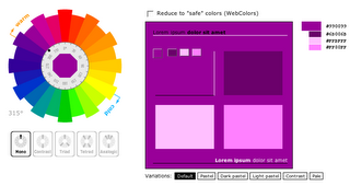
WellStyled

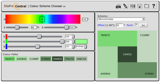
Site Pro Central

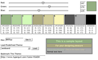
HyperGurl
Some advanced tips to try when using these tools:
Download color palettes for Photoshop & Illustrator
With the HyperGurl tool, you can download the palette you created. At the bottom of the page you can click "export to Photoshop" or "export to Illustrator."
To open your color palette in Photoshop CS2:
1. open PhotoShop
2. go to your color palette, click on the swatches tab
3. click on the arrow button
4. select "load swatches"
5. select file from your desktop
6. bam! your color scheme swatches will appear within your swatch palette.
To open your color palette in Illustrator CS2:
1. open or create a new document in Illustrator
2. click on the arrow button in your swatch palette
3. select "open swatch library"
4. select (at bottom of list) "other library"
5. click on the file you've downloaded (might be on your desktop)
6. click "open"
7. done! Your new swatches will appear in a new swatch window.
Use Adobe Photoshop with the WellStyled tool
Try a color scheme, take a screen shot picture of what you made, bring it into Photoshop, and adjust it (with the levels tool or another color adjusting tool) to make the colors more muted.
Determine what color scheme is best for your site
You have to determine what scheme is good for your site. A financial advisor's site would not do well with the color scheme of a Kid's Game site. You want your content and images to shine and be complimented by color, not overwhelmed by it, so by choosing slightly more muted colors your site will look more professional and less manic...not to mention easier on the eyes!
If you want something more sophisticated, here are a couple paid programs to try:
Color Wheel Pro
ColorSchemer